Working with components
A component in Figma is a design element that's available in the library.
With Figma, components are organized in the asset library by how they are structured and named in the file. The default hierarchy is File/Page/Frame/Layer. There are two methods for organizing components:
- Using Figma's Variants feature.
- Using a slash naming convention.
For the rest of this guide, components created with Figma's variants feature will be referred to as variant or variants. Here's our working hierarchy for structure and naming, the file name has been left out for brevity:
- Page:
[Component] - Frame:
[Component],[Category],[Group],[Elements]or literally "Variants." - Layer:
[Property=Value, Property=Value]as a variant or[Breakpoint/Item/Size/State]when manually organized.- Optional breakpoints: xs, sm, md, lg, xl, breakpoints can also use symbols to indicate range, such as ≥md or ≤sm
- Optional sizes: xs, sm, md, lg, xl, xxl
When creating a component as a variant, only a single instance of that component will be listed in the asset library. After adding the component to your design you'll have the ability to choose the variant needed based on available properties (see examples below).
If a component is not part of a variant container, numerically prefixing the breakpoint and size abbreviations correctly orders them in the asset library in a way that helps a user understand hierarchy (see examples below).
Lastly, when you create a component variant in Figma it automatically adds a border radius and dashed purple border to the frame. Remove both the border radius and border.
Examples
Icons
- Page: Icons
- Frame: Actions
- Layer: Export
- Result: Icons/Actions/Export
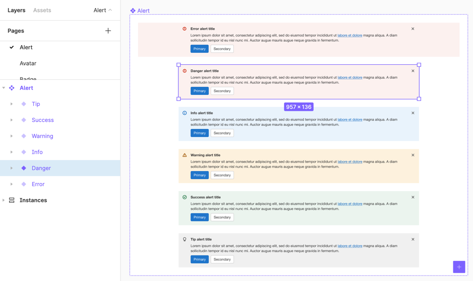
Alert
- Page: Alert
- Frame (container): Alert
- Layer: Variant=danger, Is max width=false
- Result: Alert/Alert
Pagination
- Page: Pagination
- Frame: Pagination
- Layer: Variant=full (default), Breakpoint=≥md, Has truncation=false
- Result: Pagination/Pagination
Badge
- Page: Badge
- Frame: Pipeline badge
- Layer: Variant=running, Size=sm
- Result: Badge/Pipeline badge
Button
- Page: Button
- Frame: Default
- Layer: Category=primary, Type=dropdown split, Size=md
- Result: Button/Default
| Layers panel | Assets panel |
|---|---|
 |  |
Building components
Base components
We don't use base components in the UI kit. Previously, they were the recommended approach for creating a foundation for component configuration and structure. Figma features like multi-edit now make it easier to maintain larger component matrixes. By no longer using base components we gain the following benefits:
- Reduce file bloat and improve prototype performance.
- Allow more isolated component updates, reducing the frequency and impact of breaking changes.
- Improve override persistence for nested component instances.
Base components often contained all possible component options, which caused components built using them to contain many hidden layers and properties. These hidden elements led to file bloat and prototype performance issues.
A flatter component structure allows more direct component updates, minimizing the number of variants that need to change.
Components nested within other components preserve overrides less readily than components nested at the top level. Avoid base components to reduce issues with override persistence.
Base components are currently being replaced as part of &22.
Elements
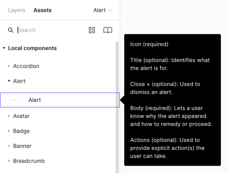
With a nod to atomic design, an element is something that cannot be broken down any further, and is primarily used in the construction of other components. In other words, it's rarely used alone. Since elements can be used and swapped in other components, they're published to the library. A good example of an element is a checkbox, which could be used in forms with a label, or as part of a multiselect dropdown.
Integrated components
To enhance performance and reduce component complexity, we sometimes create a simplified version of a component directly within another component. This approach avoids nesting a full component instance with all its variants, properties, and options. We call this an integrated component.
When creating a integrated component inside a Figma component, we use Figma variables to keep these 'pseudo-components' in sync with the real component. For example, we use a Figma variable to control the border radius of the badge component and integrated badge components. Using variables allows properties to be centrally managed, ensuring consistency between components and integrated components.
Apply this method selectively, as direct nesting may sometimes still be preferable. When applying:
- Open the 📙 Component library collection named 'Integrated components'.
- Check if the component already exists in the collection, otherwise, create a minimal set of Figma Variables for the component.
- Group by component name, for example 'Tooltip' or 'Badge'.
- Focus on values not controlled by other styles, like spacing or border radius (these properties may eventually be replaced with design tokens, but color is currently the only supported design token category).
- Follow the design token naming convention, though these are not design tokens. Only add a description where the name is ambiguous.
- Hide variables from publishing.
As an example, ❖ Tab item uses this technique for the optional badge element.
Variants
A variant is the most common form of a component. It is available to use as-is from the asset library, and does not require style overrides, although they may be available. In most cases, the content can be overridden for the context. Variants are often built from a base component, but this isn't required. A variant often has properties associated with it that can be quickly swapped in the properties panel.
Consider placing the most commonly used variant first (top, left) in the set so that it's the option that gets inserted initially from the library.
Using constraints
Objects within a component will use constraints when they need to maintain their position relative to the component bounds, or content within. Complex, responsive components can be created by combining frames and layout grids. A tooltip is a good candidate for constraints, so that directional tips can always be placed correctly in relation to the component bounds as the content grows.
Using auto layout
Components with auto layout dynamically resize based on the content within. This works well for components that need to maintain padding and spacing. A button is a good candidate for auto layout, because it can resize horizontally based on label length, and whether or not icons are included. Complex responsive-like components, like a modal, can be created with auto layout.
Using slots
A slot is an area within a component where content can be inserted or swapped out using a sub-component. Using slots in a component allows for content insertion while maintaining component structure and functionality.
When creating a slot, ensure that spacing comes from the parent component, not the child sub-component. This maintains consistent layout regardless of the content inserted into the slot.
| Do | Don't |
|---|---|
 |
 |
Place all functional controls in the main component, not in the sub-component. For example, if a popover can have an optional close button, the close button and its associated property should be part of the popover component, not the slot sub-component.
Always provide basic or example sub-component options for a component with slots. These should be published as part of the library and added to the component as preferred values, ensuring designers can easily see and select them. Include variations such as small content, large content, or real product content examples. Additionally, include an obvious "build your own" option in the slot choices to encourage customization when needed.
Using Figma variables
When building components, set properties with design tokens where possible. Only create new Figma variables in the UI kit to keep integrated components in sync.
Naming properties
Use the following guidelines and principles when naming properties. Consistent naming will make components easier to maintain and use.
- Capitalize first character of the key (property name) and use all lowercase for each value. For example, "State: rest, hover, focus, active".
- Properties should be as abstract as possible to indicate intent over style. For example, "Color: muted, enhanced" instead of "Color: light gray, blue".
- Mark default properties by adding
(default)after the property name. For example, "Size: sm, md (default), lg". - Keys can be presented conversationally using 'is' or 'has'. For example, "Has icon: true, false", or "Is checked: unchecked, indeterminate, checked".
- For true/false values, the positive is always first. For example, "Is selected: true, false".
- For size or weight, list least to greatest. For example, "Size: default, sm, md, lg" or "Weight: light, regular, bold".
- Only use a property when an attribute should be explicitly configurable.
Here are the standard properties and value ordering that can be used. If you need a property that isn't on the list, and it could be useful for other components, please create an issue or MR to add it.
- Size: xs, sm, md, lg, xl
- Font: sans-serif, monospace
- Font weight: light, regular, bold
- Position: top, right, bottom, left
- Save state: pristine, saving, dirty
- State: rest, hover, focus, active, disabled
- Is expanded: true, false
- Is read-only: true, false
- Is selected: true, false
- Is checked: unchecked, indeterminate, checked
- Is sticky: true, false
Some properties directly relate to others. They can always be available, or conditionally available based on the value of another property.
-
Ensure a related property is directly below the main property and prefix it with
↳. There can be multiple related properties. For example:Has label = "true" ↳ Text = "Text property"
Last updated at: